
Using the Homepage Carousel
The homepage carousel is a flexible way to showcase promotions, memberships, events and other key content.
LEAP gives you several layout options, allowing you to choose the presentation that best suits your content.
A carousel can contain up to five slides, each with its own image, heading, content and call-to-action.
Step 1: Enable Carousel Mode
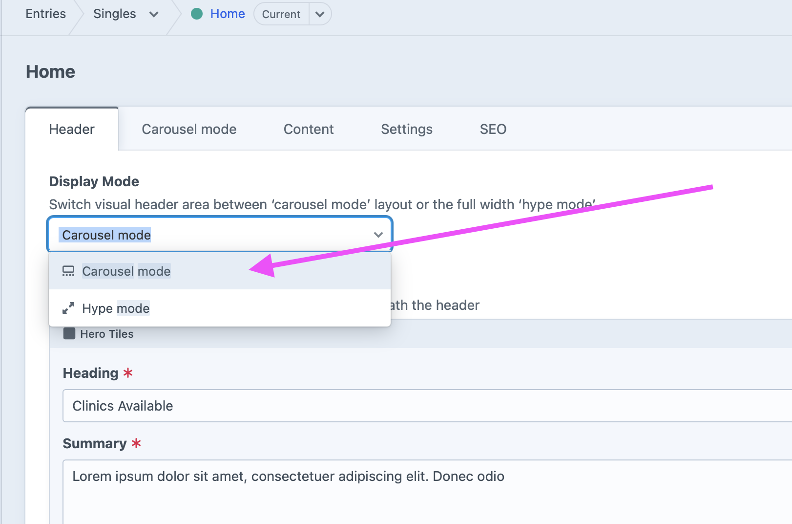
Open your homepage (or another page that supports headers) and go to the Header tab.
Under Display Mode, select Carousel mode.
Once selected, a new Carousel mode tab will appear.
Step 2: Choose a Carousel Type
Open the Carousel mode tab and select the layout you’d like to use.
LEAP currently offers four carousel styles.
Visual
A full-width image carousel designed to make a strong visual impact.
Best for:
- Campaign launches
- Hero imagery
- Brand photography
- Membership promotions
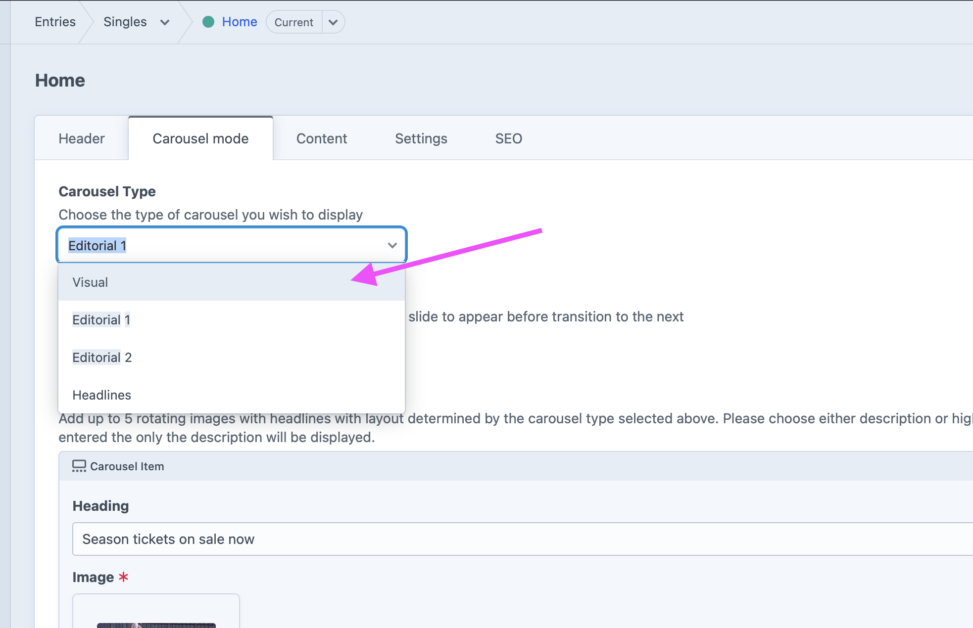
Editorial 1
A 70/30 split layout featuring:
- Large feature image
- Content panel on the right
Best for:
- Longer messaging
- Product launches
- Membership campaigns
- Hospitality promotions
Editorial 2
A balanced 50/50 split between image and content.
Best for:
- Promotional content
- Equal emphasis on imagery and messaging
- Editorial-style storytelling
Headlines
Displays a large feature image with headline content overlaid.
Rather than a paragraph of text, this layout is designed around concise messaging using highlights or bullet points.
Best for:
- Key announcements
- Feature lists
- Selling points
- Campaign highlights
Step 3: Add Carousel Items
Each carousel can contain up to five items.
Each item becomes a slide within the rotating carousel.
Simply click Add Carousel Item to create additional slides.
Configuring a Carousel Item
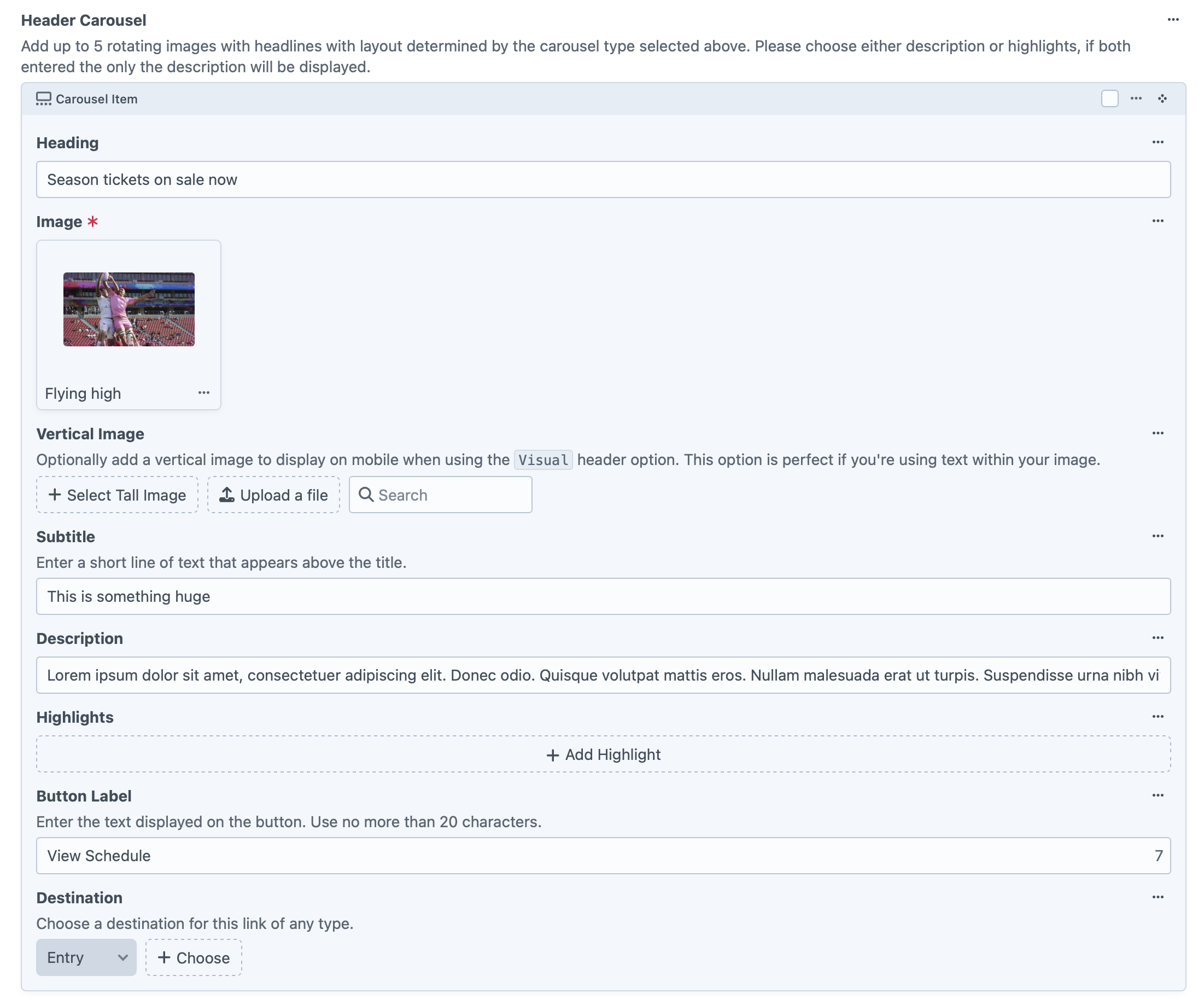
Each slide includes a number of optional fields, allowing you to customise both the appearance and behaviour.
Heading
The main title displayed on the slide.
Keep headings concise and impactful.
Image
The primary desktop image for the carousel.
Choose a high-quality landscape image for the best results.
Vertical Image (Optional)
Available when using the Visual carousel type.
This image is displayed on mobile devices and is ideal when:
- Your desktop image contains embedded text
- A portrait crop provides a better mobile experience
If no vertical image is supplied, the desktop image will be used instead.
Subtitle
A short line of text displayed above the heading.
Useful for:
- Categories
- Campaign names
- Small promotional messages
Example:
Membership 2027
Description
The main body copy for the slide.
Keep descriptions concise, typically one or two short paragraphs.
Highlights
Add a series of short highlight points to emphasise key information.
Examples:
- Reserved seating included
- Flexible payment options
- Priority member access
Note: If both Description and Highlights are entered, the Description will take precedence and the highlights will not be displayed.
Button Label
Customise the text displayed on the call-to-action button.
Examples:
- Buy Now
- Learn More
- View Packages
- View Schedule
For best results, keep button labels under 20 characters.
Destination
Choose where the button should link using Craft CMS’s flexible Link field.
Destinations can include:
- Entries
- Categories
- Assets
- External URLs
- Email addresses
Tips for an Effective Carousel
- Limit the carousel to 3–5 slides to keep content focused.
- Use high-quality imagery that reflects your brand.
- Keep headings short and easy to scan.
- Include a clear call-to-action on every slide.
- Use one key message per slide rather than trying to communicate too much at once.
Which Carousel Type Should I Use?
| Carousel Type | Best For |
|---|---|
| Visual | Full-width campaign imagery and hero banners |
| Editorial 1 | Large image with supporting content (70/30 layout) |
| Editorial 2 | Balanced image and content (50/50 layout) |
| Headlines | Image with concise highlights and promotional messaging |
Summary
The homepage carousel is one of LEAP’s most powerful content features, allowing you to create engaging, promotional hero areas without developer assistance.
Simply:
- Select Carousel mode in the Header tab.
- Choose the carousel layout that best suits your content.
- Add up to five carousel items.
- Configure each slide with images, messaging and links.
- Save your changes and publish.